After the successful launch of our exhibit website and social media sites the Marketing/Publicity Team (Desiree, Stevy, and myself) has shifted from web based to print based media with the creation of the exhibition postcard. From our discussions with Mike Watts and other members of the Tarble staff it is clear that the postcard is one of the main promotional materials for the exhibit, making it a key component in our marketing/publicity plan. This is also something that is an important part of nearly all exhibits. In Artist Emerging, fellow exhibit blogger Deanna described some of the main points for good postcard design. Here is an example:
Put a striking image on the front: Start with a great photograph or slide of your work. Pick the best piece from your show and get a great shot of it. An intriguing detail shot can be interesting and mysterious.
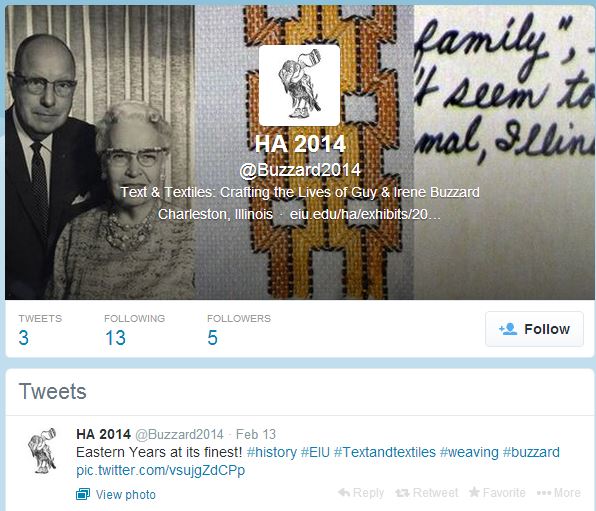
In the early days of our research we (Dr. RP and HA class 2014) came up with three images taken from the Buzzard Scrapbook and the textile collection at the Tarble. These images (shown below) represent the themes of the exhibit and visually show the ‘Text and Textiles’. These images were compiled into one banner which became the main design or “brand”, to quote Cate, for the Text and Textiles exhibit as seen on our website and social media. The first is a picture of Robert (Guy) and Irene Buzzard taken from a newspaper article highlighting their interests and skills in weaving. The second shows an example of huck weaving, probably created by Guy Buzzard during the early 1950s. The final image was used for the text at the bottom, which describes the beginnings of the Buzzard family.

Part of our struggles throughout the exhibition process has been to make the Buzzards come alive, to fly off the pages of their texts if you will. In order to do this, the exhibition and education teams have been working on incorporating different color combinations and label designs to add visual appeal to the objects and give the e-Gallery some pizazz. Our team (marketing/publicity) has been working closely with Jamie (Jo) the graphics designer at the Tarble who was crucial in making this happen. We came to her late last week with just these images and a basic concept for the design. Here is what she came up with and like Amanda said in her recent blog, seeing it makes the exhibit so much more real!

Here’s the back with our exhibit info and blurb:

Desiree also researched QR codes and worked with Jo to add it into the design on the back. This code will lead back to our website and provide connections between our physical and digital media.
While this is still the first draft of the exhibit postcard we are very excited to present it in class tomorrow and gain feedback from our fellow HA students and Dr. RP. For those who live on campus at EIU or in the Charleston/Mattoon area you’ll be seeing these around campus and in the mail in the next month or so, so get ready. The Buzzards are coming to Charleston!
Check our our website at: http://www.eiu.edu/ha/exhibits/2014/home.html
http://artistemerging.blogspot.com/2006/10/postcards.html