Author: aerhursch

Emerging museum professional spending summer 2014 interning in Walhain, Belgium!

Construction has begun!

That’s right, our exhibition construction has started!

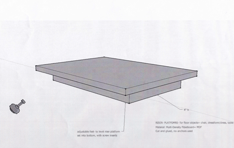
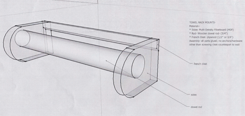
Thanks to the assistance of Mike S. and student workers at the Tarble our towel racks and platform risers have been completed!  The three section color paints (green, blue, and red) have been purchased and painting will begin shortly.  Mike S.’s mockups of the platform riser and towel rack are pictured below.

Image

Image

Our label formatting was also finalized this week and all labels and pictures have been submitted to Media Services to be printed!  The class will learn to mount labels in the next few weeks.

Since the beginning of the budgeting process, we have wanted to buy as many materials from local businesses as possible.  Although shopping local has not been an option with all of our purchases, we’ve done pretty well!  One of our largest purchases was vinyl wall-cling quotes to be placed on the wall in each section. Thanks to Undercutters, here in Charleston, we’ve been able to keep that expense local.

The exhibition team also submitted our final budget this week and ended up further under budget than expected.  Some changes were made to the construction of our wall sections, which cut the price of materials nearly in half.  Hopefully we will not encounter any surprises and will continue to be under budget!

Not to scare my colleagues, but our exhibit opens in less than a month!

Who knew there are so many different shades of brown?!

This has been a week of exciting changes to the exhibition design and layout!

As Caitlin explained last week, she and I re-learned photoshop in order to format our labels.  The original label plan involved a black font on a bone colored background.  After a lengthy discussion with the class and our partners at the Tarble, it was decided that a brown font on the bone background would be more suitable. This will allow the labels to coordinate nicely with the artifacts, as well as the brown carpet and slightly off-white walls of the Tarble gallery. 

This change in label colors then brought up the suggestion that perhaps the photographs in the exhibition should all be sepia-toned rather than left in their original black-and-white or color form.  This became a heated debate between classmates with votes split 50/50 between sepia-toning and original.  Finally, it was agreed that all of the photographs will be sepia-toned, because as a classmate pointed out, “everything looks better in sepia!”  After spending some time with the Buzzard photos and the sepia option on photoshop, I am amazed by many different shades of brown available!  Here is an example of our bone label background, brown font color, three chronological section colors, and a sepia-toned Buzzard family photo, created by Brittany Contratto.

Image

The exhibition committee also had the opportunity to meet with Mike Schuetz in the gallery space at the Tarble to discuss wall panel measurements. After measuring the space and realizing that the gallery is really quite small in person, we have decided to shorten the width of our panels to allow for more space for the visitor to move around.  

The exhibition team is planning to start pulling artifacts this week and is beginning the fabrication of mounts in the very near future!  Our labels and pictures, all in the correct shades of brown, will be submitted to Media Services for printing on Tuesday.  The exhibition is suddenly feeling very real!!